The difference between what becomes irrelevant in cyberspace, and what commands respect is rooted in the design discipline. A truly "modern" website template is defined not by trend, rather by principles, that integrate form, function, accessibility, and psychological impact on the user. This all can be considered as a strategic investment wholely centered on engagement, conversation, and conversion.
Here are five design principles that set apart a truly modern template from traditional contemporary templates we saw forego.
Radical Clarity & Thoughtful Layouts
Gone are the days of heavy user interface paradigms and obscure messaging. The standout design principle of the modern website template is radical clarity. Each pixel, line of type, and graphic articulates a specific intent. This is accomplished using a rigid system of hierarchy and scanning comfort.
Modern design, acts on an unspoken level, to respond to user orientation requests: what is it? What does it allow me to do? What am I suppose to do next? This is one of the most bold design principles used to mitigate cognitive load not as a negative, but a robust design principle that holds content. The intense level of white space, or space, in modern design is strategic. Every typeface is selected not in style, but in the style and rhythm of readability and tonality. When the visual rhythm of typography is mastered, the typography and related content provides a visual continuum that comfortably shifts the user's experience from a value proposition to the call to action. The logical structure is profound to the point of instant user predisposition to choice rather than searching for action.
Considerate interactivity and thoughtful movements
Static web pages are an artifact of the past. In modern templates, today's designs signify interactivity and movement as a part of the experience, not just a decorative device. This is a design philosophy that is rooted in a conversation between the user and the interface.
We are considering interactions with complex functional animations like micro-interactions that are feedback-driven, e.g. buttons that change tactile properties when pressed; smooth transitions between states maintaining context; and thoughtful scrolling presentation of content. This level of dynamic design, we can accomplish two critical objectives. First, we are making it more "understandable", through providing explicit signals and making the process of interaction feel more responsive and "alive". Secondly, we are creating an emotional response, elevating the simple experience of interacting into a memorable one for users. This functionality needs to be architected in such a way that it is robotics and productive, never compromising quality.
Uncompromising performance and fundamental web characteristics
A thoughtfully designed interface that loads slowly, is poor design. In the web era, a fast-loading experience is not just a feature, it is a requirement. Users now anticipate responsive reviews, and search engines now publicly endorse sites that do. A modern day web template will be designed with this speed factor from the beginning.
This was built on the idea of one principle: incorporating a varied technical solution; from optimized, thin code, and new graphics formats (e.g. WebP or AVIF) that vastly reduce payloads, to thoughtful solutions for deferred loading and caching of resources. The final test - Google's core web metrics, a set of metrics for the time it take to load (LCP), time to interactivity (FID), and visual stability (CLS). Any design that accounts for these metrics does so from a user standpoint, not just an algorithmic approach. We all have varying levels of bandwidth and time, and a design that accounts for those factors will improve the immediate bounce rate and create immediate trust. Speed is a luxury of design.
Compelling visuals leveraging genuine photography
The simplicity of visually exhausting and unfounded stock photography can detract from its credibility. The fourth principle is that a compelling visual identity requires authentic visual identity. A contemporary website template provides an opportunity for the website to exhibit this identity.

This is expressed in a few essential and notable trends
Custom illustrations and graphics: Original artwork that illustrates your brand's personality and creates differentiation with other representations.
Bold transitional gradients & color palettes: Movement from muted and primary color palettes towards daring color choices that communicate special and impactful emotive connections.
Asymmetrical designs and broken grids/meshes: Contemporary design often brings an intentional aesthetic that is asymmetrical as a way to create visual tension and component movement and to avoid the sterile pattern of symmetry.
This is a move away from the depersonalized approach and is moving in the direction of creating something personalized, unique and contemporary, even if coming from a template design.
Heavily integrated accessibility tools
Real contemporary design is, by nature, affordable. The final, and absolute requirement is the immersion of accessibility requirements (now referred to as a11y) in the template. The fact that your online presence has included and now operates as a partner on the endeavor to be accessible to the broadest of users, with different levels of ability, is proof of your organizational competency, maturity and ethical requirements.
The accessible and contemporary website template has been constructed from HTML5 semantic code, which gives the framework of the website shape to screen readers and to navigate by keyboard, regardless of the device, conflict for color contrast for the visual impaired, and meet ARIA standards for complex widgets, should that be in use. Exposure of these commitments reflects the intention in the messaging, the potential for reduced litigious accountability, and increases the usability for all users. This is the calling card of adult, progressive design.
Synthesis of contemporary design
These are not separate flags; they are factors that related to a singular principle. A clear layout is defeated by weak performance. A distinct visual identity is hollowed out if it doesn't incorporate accessibility. A high level of interactivity needs to increase speed, not decrease it.
So a modern website template is a delicate balancing factor. It is a system in which form and function are symbiotic; each direction bolstering the other, creating an impression that is equally as aesthetically beautiful as it is incredibly functional. This is the perfect solution for brands and creatives who view their website as the most sought-after piece of digital real estate — a high-octane, high-impact communication tool engineered for an audience in a modern world. It is the new gold standard. This is modern web design.
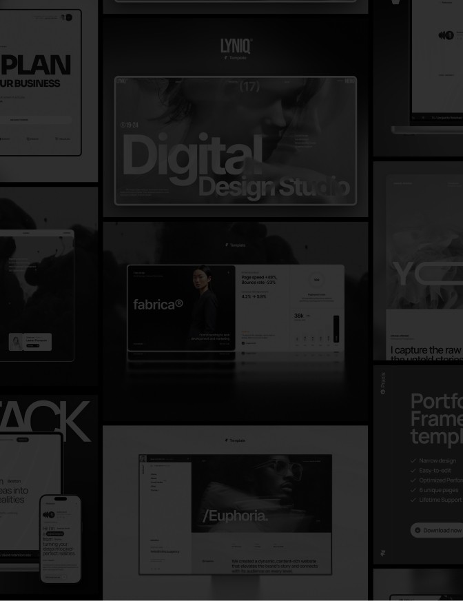
Looking for inspiration? Browse the website template gallery to see how these principles are applied in practice.
Modern Website Template - FAQ
What makes a template “modern” and what is it built with?
Modern templates lean on clean typography, generous spacing, responsive grids, and subtle micro-interactions (think hover/press states, gentle reveals, glassmorphism where it makes sense). They’re assembled with a visual editor, components and variants, and publish to fast, semantic output tuned for Core Web Vitals. Dark mode, fluid type, and accessibility are considered from the start rather than bolted on later.
How do I customize the animations and interactive elements?
For example, In Framer you tweak interactions visually: adjust durations, easings, delays, and triggers (on hover, on tap, on scroll into view) right in the right-hand panel. You can enable or tone down parallax and scroll transforms, set reduced-motion fallbacks, or disable effects per element. Need something special? Extend with Code Components for custom logic while keeping the rest no-code.
How do I optimize a template for performance and SEO?
Performance comes from the basics done well: automatic image optimization (WebP/AVIF), lazy loading, sensible font loading, and keeping third-party scripts lean—aiming for solid LCP/CLS/INP scores. For SEO, fill out titles, meta descriptions, and Open Graph fields per page, use clean heading hierarchy, descriptive alt text, and human-friendly slugs; Framer handles sitemaps and canonical tags on publish. Accessibility rounds it out: meaningful labels, keyboard navigation, visible focus states, correct roles/ARIA only where needed, and quick checks with a screen reader.


