


Whether you are building for your own agency, your client, or for a portfolio, an excellent responsive template saves time and maintains usability and readability across screen sizes. In this article, we will discuss what makes a Framer template truly responsive, how to choose one, how to customize it, and what to avoid in terms of working layouts.
Features That Make A Framer Template Truly Responsive
Sometimes a template says "responsive" when in fact it isn't truly responsive. Here are the main features and practices you should look for:
Fluid Layouts, Auto-Sized Component
Responsive design with Framer is often supported with Stacks, Grids, and auto-height / auto-width settings, allowing containers, cards, images and text to flow naturally. When the screen is shrunk or expanded, these elements should reflow, resize or wrap proportionately and not break layout.
Breakpoints for Adaptive Styling
Framer supports breakpoints (desktop -> tablet -> mobile), allowing you to define styles, spacing, or layout at specific widths. Templates should allow you to override style at those breakpoints to maintain usability/readability.
Rigid Pixel Widths or Fixed Widths and Overflow
Templates should never contain rigid px widths or positions that cannot adapt to wider or less wider. Elements should always use relative units, constraints or utilize flexible containers which should result in no horizontal scroll or clipped text on screen height in narrow widths.
Responsive Typography and Images
Text sizes, line heights, padding, margins should all scale or adjust per breakpoint. Images should also use responsive loading (smaller variants on mobile, cropping or scaling) or vector formats when appropriate.
Template Requirements and Standards
Framer has template requirements that highlight responsiveness as a must. Templates submitted to the Framer marketplace must work well and reasonably fluid at all screen sizes, and specifically demonstrate some use of stacks, grids, and auto-height to maintain responsive layouts.
Examples of Responsive Framer Templates for Your Use
There are a few sources of templates that provide responsive Framer templates you can change:
Framer Marketplace: the official marketplace that has hundreds of responsive templates in multiple categories (business, portfolios, landing pages).
Landing Page category: a subset of templates that really help with optimizing the conversion funnel, and there is still responsiveness built in.
Templifica.com: A curated platform offering a diverse selection of modern, responsive Framer templates. Templifica emphasizes ease of use and visual consistency across devices, with templates designed to simplify customization for both portfolios and business sites.
When you are looking around the marketplace, do yourself a favor and pull up the template on mobile and tablet for yourself to see how the elements shift or wrap and so on or go nonexistent.
How You Customise & Adapt a Responsive Framer Template To Your Use Case
As you are considering a responsive template here is how not to be stressed out as you customise the template to be more unique to your content and brand/identity:
Always Create a Duplicate/Copy
Create a duplicate / copy of what you are working on, so you still have the original to look at. Name the pages, components and layers something that makes sense (Hero, Features, Footer) so you don’t get overwhelmed to try and find it.
Set Global Style Tokens
Laying out your color palette, typography (fonts, weights, sizes) and spacing (margin, paddings) as global tokens or style variables makes it easy to change them in more than one place and lets everything resort across breakpoints.
Adjust Layouts At Breakpoints
Tablets / Narrow Desktop: stack multi-column layouts in to single-column layouts, shrink the margin or just collapse out sidebars.
Mobile Devices: hide non-critical content, shrink down images, and make sure buttons and inputs can be tapped.
The devices breakpoint editor lets you adjust margins, gaps and scaling for text at each breakpoint.
Review & Revise Interactions
What may feel good on desktop sometimes on small devices can feel heavy or janky. It is always worthwhile to simplify animations, transitions, interactions etc. for smaller devices.
Test the site on real devices / device emulators.
Always borrow people's phones and/or tablets. Emulators (desktop web browser response to tester, dev tools) is helpful, but very likely will miss as shifting. Don’t forget landscape ↔ portrait, even test that as it may act very differently.
Watch Performance & Load
Mostly on Mobile; Large image size and file size, heavy script, very nice animation all contribute to the type of experience. Use proper and optimised image formats/types, lazy load images, and authenticated scripts to each breakpoint of optimal performance while keeping the site responsive.
Best Practices & Pitfalls to Avoid
Don’t only design a desktop first; designing for mobiles first will eliminate potential of mismatches for a large screen compared to if designing down from desktop.
Don’t use inheritance too liberally; always set base styles at the root (desktop) and only override there. Inheritance should for efficiency only happen in the breakpoints don’t inherit everything.
Look for overflow or clipping - one mispositioned item can screw up the layout that is breaking performance that sometimes, the aliasing of styles would compete.
Don’t forget about typography on mobile - small text sizes and tight line spacing will ruin any potential for more readable.
Avoid complex animations on small screens - do less or create conditionals on any motion.
Do test usability of the navigation - ensuring the toggles or navigation elements (menu, collapsible items) are easy to tap on small screens.
Do create Snapshots - make a habit of creating snapshots to back things up. Especially before making drastic changes to the layout, responsiveness.
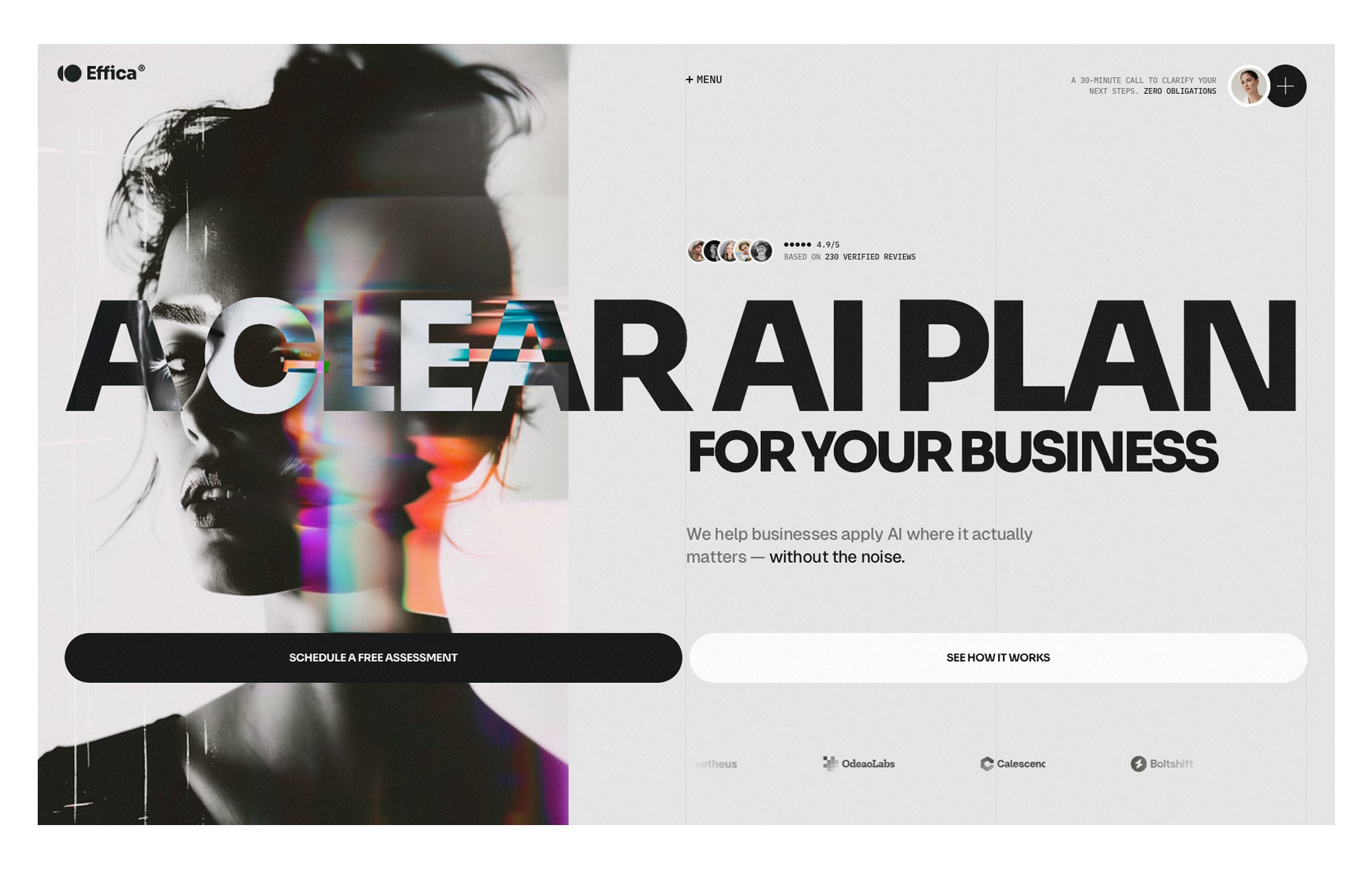
And if you’d like a ready-to-go example that embodies everything we’ve discussed, check out the template Effica. Iit’s built for agencies, consulting firms or AI-businesses, with pre-designed pages for Home, Services, Case Studies, Testimonials — all wrapped in fully responsive layouts that adapt smoothly across desktop, tablet and mobile.
FAQ
Q1: Are Framer templates automatically responsive?
Not every time. Although, some templates are designed to be responsive, you should test all layouts and breakpoints. In some cases dynamic elements could require modifying or overriding styles for every breakpoint.
Q2: How do I change breakpoints or add custom breakpoints?
Yes - Framer offers a setting to establish and change the breakpoints. You can customize how content reacts at different widths, and modify whether the layout or styling rules should apply.
Q3: Does responsiveness slow down my site?
It can, especially if you are requesting multiple large assets, using very complex animations, or you have made no effort to optimize media for different screens. However, a properly lazy loaded, compressed, and conditionally rendered responsive site can still be performed at relatively high level.
Q4: Should I design for mobile first, or desktop first?
There are very different design philosophies - mobile first may help you set priorities for your key content, and try to keep a lean mobile view. Although, many workflows will default to desktop and design down. In either case, the goal is to take time at each breakpoint to thoughtfully refine the elements of each design.
Q5: How many breakpoints are there?
Typically three - desktop, tablet and mobile; more hip designs will occasionally add a larges screen / ultra wide breakpoint. The bottom line is don't overdo it, use as many as you need per design, just no more.


